
Pattern mixing in home decor is an art form that can transform any space from ordinary to extraordinary, infusing it with personality and flair. Whether you’re just beginning your design journey or have been experimenting with decor for years, mastering the art of mixing patterns can bring a fresh, dynamic energy to your home. By understanding the interplay of colors, textures, and motifs, you can create a harmonious environment that resonates with your personal style.
In this article, we’ll guide you through 11 smart strategies to mix patterns confidently and effectively, helping you strike the perfect balance between boldness and cohesion. You’ll discover how to layer patterns to enhance the character of a room, how to mix and match with intention, and how to use patterns to draw attention to key features in your space. Embrace the opportunity to express your creativity and elevate your interior design skills—whether you’re looking to make subtle changes or daring transformations, there’s something here for everyone.
Understanding Pattern Basics
Understanding the basics of patterns in home decor can dramatically transform your space. Patterns add depth, interest, and personality to a room, making it feel more dynamic and inviting.
For beginners, it’s essential to start with simpler patterns like stripes or polka dots, which are easier to mix and match. These patterns can be incorporated through throw pillows, rugs, or curtains to create a cohesive look without overwhelming the space.
Advanced decorators may opt to experiment with a combination of bold patterns, such as florals and geometrics, to create a more eclectic vibe. To successfully mix these, focus on maintaining a consistent color palette, ensuring the patterns complement rather than clash with each other.
When selecting furniture with patterns, consider the scale of the pattern in relation to the size of the room. Larger patterns work best in spacious areas where they can be appreciated, while smaller patterns may suit compact spaces to maintain a sense of balance.
Layering Complementary Textiles
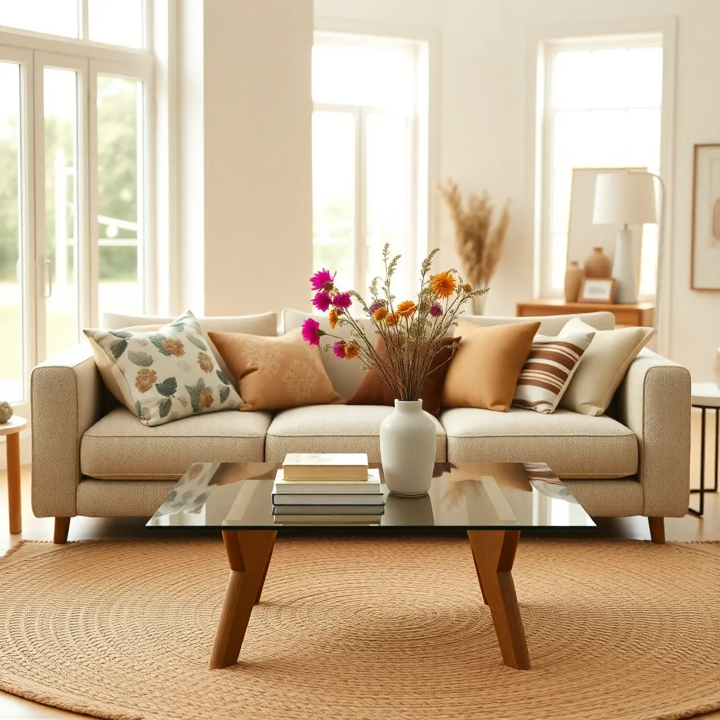
Layering complementary textiles is an art that can transform any room from ordinary to extraordinary. Start by selecting a base fabric that anchors the space, such as a neutral-toned sofa or a solid-colored area rug.
Building on this foundation, introduce secondary textiles that add depth and interest, like patterned throw pillows or a textured blanket. Choose patterns that complement the base color, incorporating subtle variations in tone to maintain cohesion.
For a more advanced touch, experiment with mixing different fabric types, such as pairing a silk curtain with a wool throw for a sophisticated contrast. The key is to maintain balance by ensuring at least one element, like color or pattern scale, ties the textiles together.
When placing these textiles, consider the room’s flow and focal points. Arrange pillows in odd numbers for a casual, inviting look, and drape throws over furniture edges to create a lived-in, cozy atmosphere.
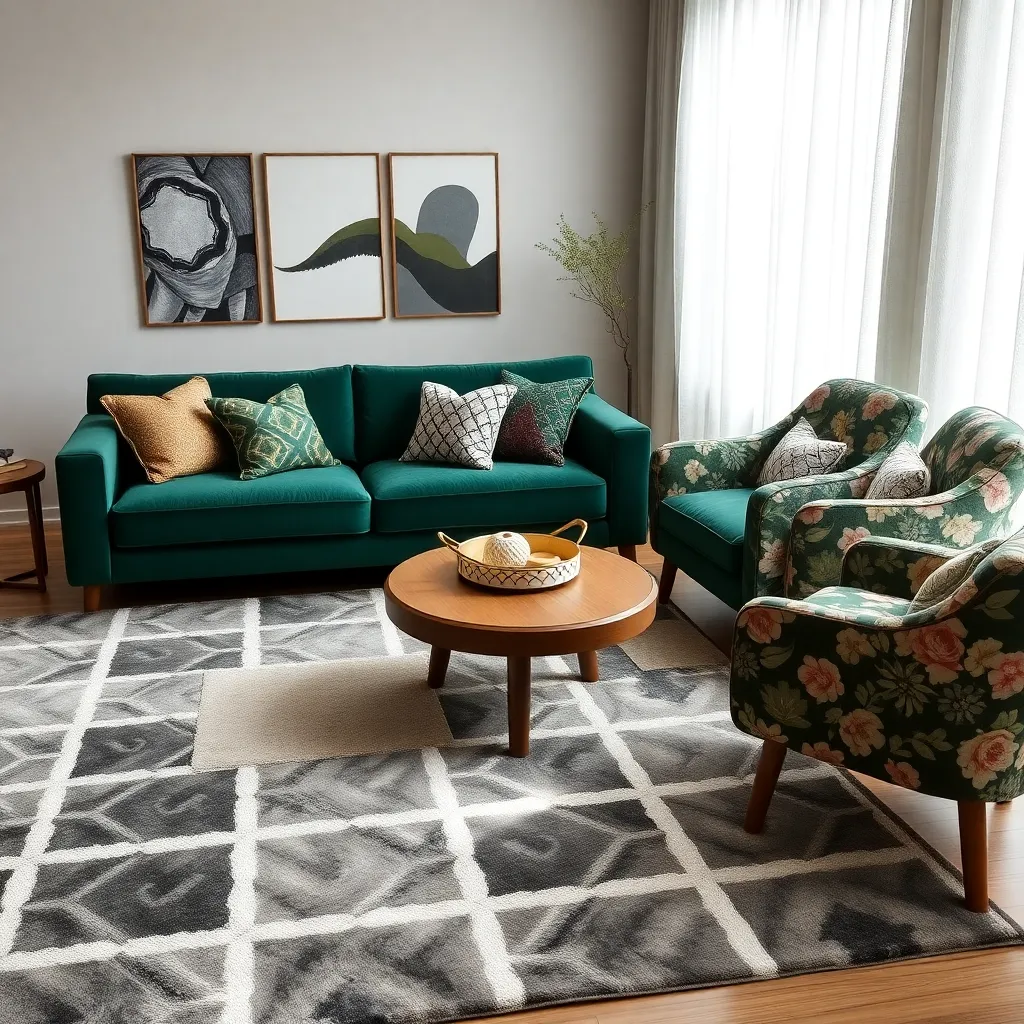
Mixing Geometric and Floral Designs
Combining geometric and floral designs in your home decor can create a visually dynamic and harmonious space. To achieve this balance, start by selecting a primary color scheme that ties the patterns together, such as a neutral base with bold accents or a vibrant palette that includes both pattern elements.
For beginners, an effective technique is to use floral patterns on larger furniture pieces like a sofa or a large area rug, while incorporating geometric patterns in smaller accents such as throw pillows or a side chair. This approach allows the floral design to serve as the focal point, while the geometric details add structure and interest without overwhelming the space.
Advanced decorators might experiment with layering patterns by choosing a statement wall with geometric wallpaper and contrasting it with floral curtains or bedding. This juxtaposition can be striking, especially when the geometric pattern provides a structured backdrop that emphasizes the organic curves of floral designs.
When mixing these patterns, consider using different textures to enhance the depth of your decor. For instance, a velvet floral cushion can pair beautifully with a sleek, geometric metal lamp, adding both visual interest and tactile variety to the room.
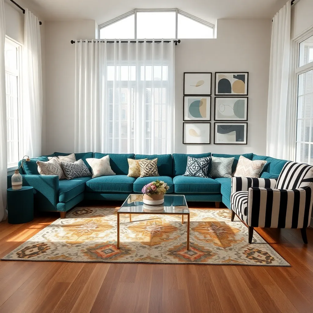
Incorporating Stripes for Structure
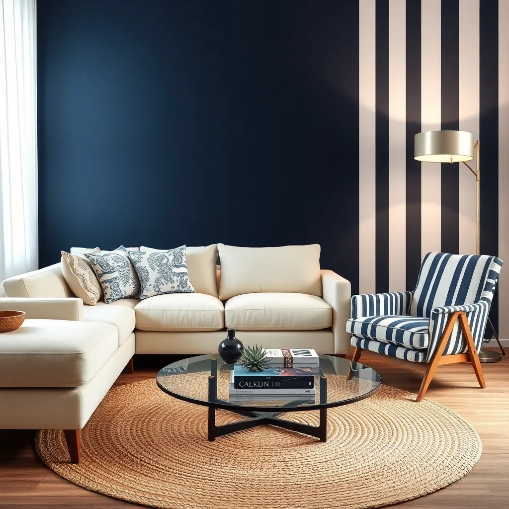
Stripes can add a sense of order and elegance to any room, providing a structural element that guides the eye. They can be introduced through wallpaper, upholstery, or even a simple striped rug to create a focal point in the space.
To harmonize stripes with existing decor, consider a neutral color palette that complements your current pieces. For those feeling bold, vibrant stripes can serve as a striking counterpoint to solid colors, adding a layer of depth and interest.
Incorporating stripes through furniture can be both subtle and impactful. A striped armchair or a sofa with a striped throw can introduce texture and pattern without overwhelming the room.
For more advanced decorators, mixing stripes with other patterns requires careful balance. Use stripes to highlight architectural features, such as a stripe-painted ceiling to draw attention upward, creating an illusion of height in the room.
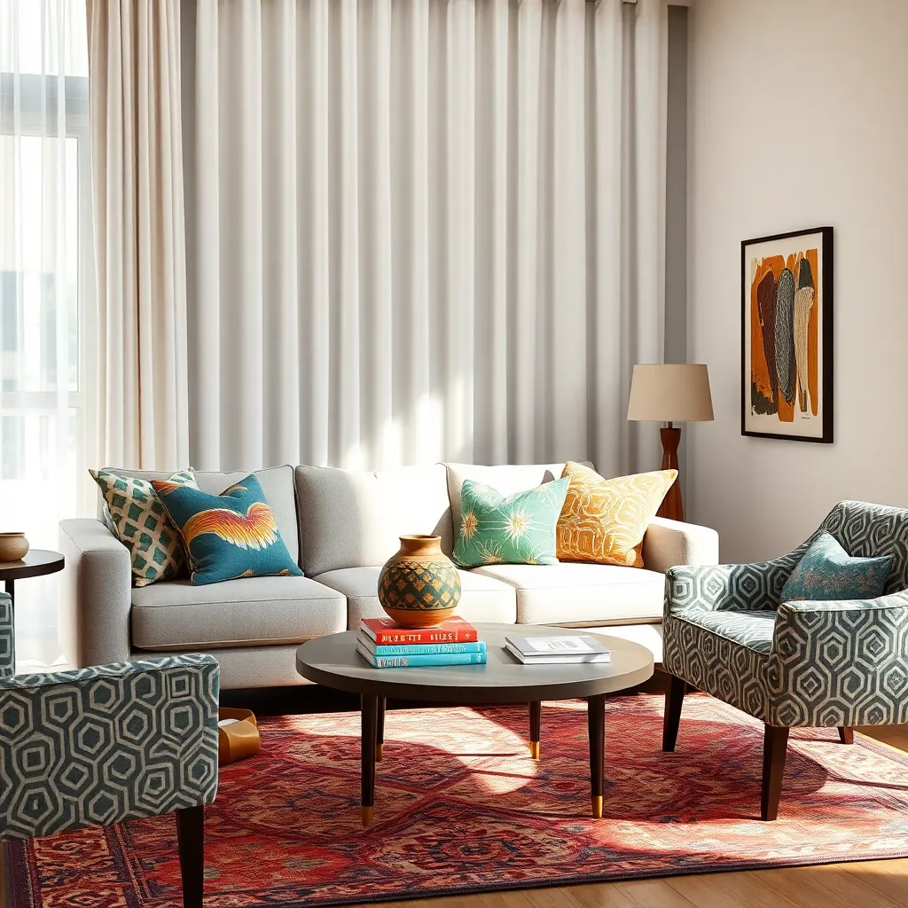
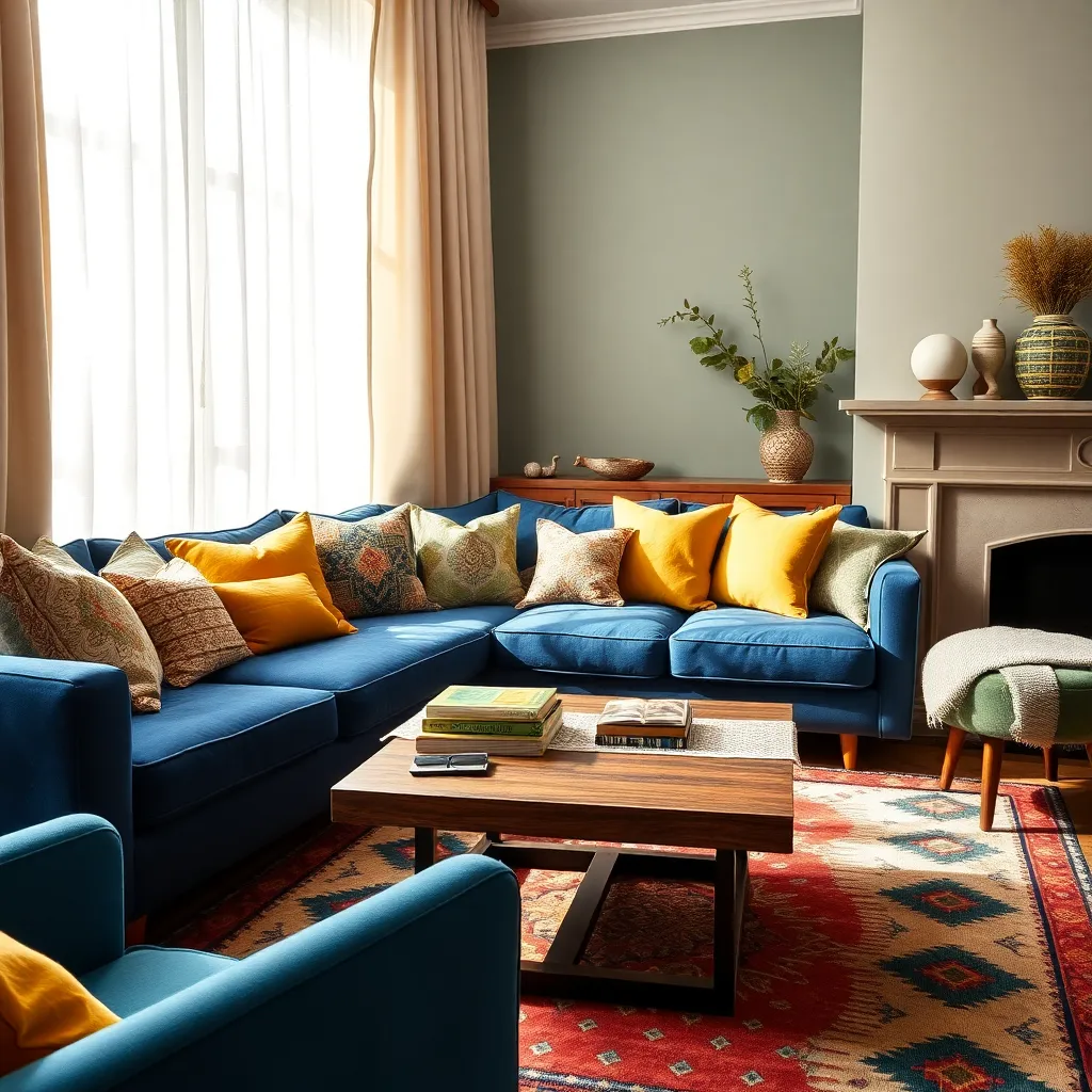
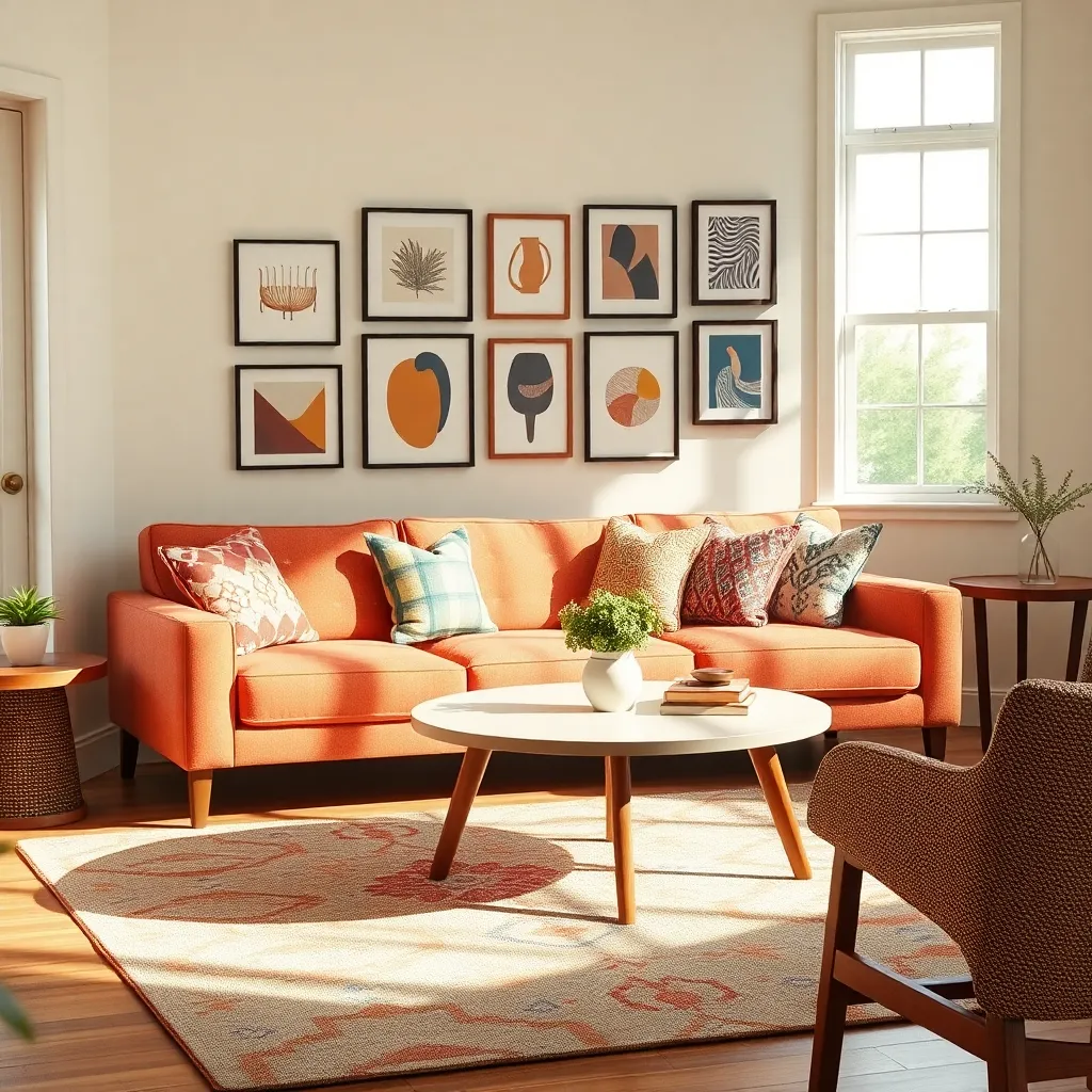
Balancing Bold and Subtle Prints
Balancing bold and subtle prints can create a harmonious and dynamic space in your home. Start by choosing a standout pattern, like a vibrant floral or geometric print, as the focal point in a room. This could be a bold rug or an eye-catching piece of artwork. Once you have your primary pattern, incorporate subtler prints that complement the dominant design. This helps maintain a cohesive look without overwhelming the space.
For beginners, consider using neutral tones in your subtle prints to ensure they blend seamlessly with the bold elements. This could be in the form of small-scale patterns on throw pillows or curtains, which provide texture without clashing. Pairing a bold, colorful sofa with a muted, herringbone patterned rug can add depth and interest to your decor without overpowering the eye. Advanced decorators can experiment with layering different scales of the same pattern. For example, a large floral print wallpaper can be beautifully balanced by smaller floral motifs on cushions.
Placement is key when mixing bold and subtle prints. Distribute patterns evenly throughout the room to avoid clustering, which can make the space feel chaotic. Position bold pieces like a patterned armchair or a striking duvet cover centrally to draw attention. Then, echo these patterns with smaller, subtle accents throughout the room, such as a soft throw or understated lamp shades. This technique ensures a balanced visual flow.
When selecting colors, it’s vital to stick to a cohesive palette that ties the patterns together. Choose a few key colors from your bold print and reflect these in your subtler designs. This strategy can be applied by picking out a vibrant hue from a statement rug and using it in a more subdued fabric on your sofa cushions. Mixing prints effectively requires a keen eye for detail, but by following these guidelines, you can create a space that’s not only balanced but also uniquely yours.
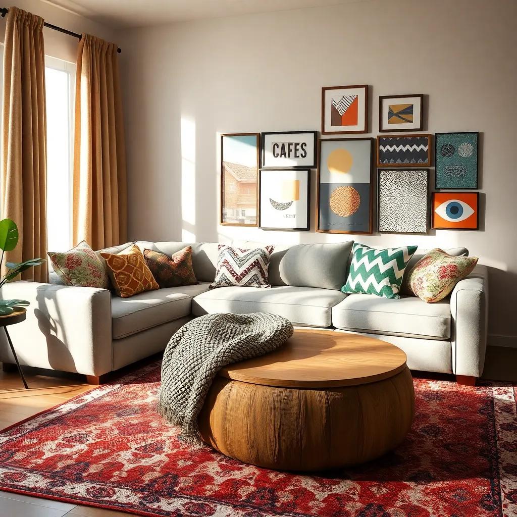
Using Patterns to Define Space
Patterns can be a powerful tool for defining different areas within a room. By using a variety of patterns, you can create distinct spaces without the need for physical dividers. For instance, consider using a bold geometric rug to anchor a living room seating area. This approach not only adds visual interest but also helps delineate the space from the rest of the room.
Another effective method is to incorporate patterns through wallpaper or paint techniques. Applying a graphic wallpaper on one wall can establish a focal point, setting the tone for the entire area. Alternatively, you might use a stencil to create a patterned accent wall in a home office, giving it a distinct identity separate from the adjacent dining room. Choose colors that complement your existing furniture to ensure a cohesive look throughout the space.
Mixing patterns effectively requires a balance between harmony and contrast. Start with a large-scale pattern on a dominant piece, like a sofa or bedspread, and layer in smaller patterns through cushions or throws. This technique adds depth and character without overwhelming the senses. Keep a consistent color palette to unify the different patterns while allowing each element to shine.
For an advanced technique, play with pattern sizes to manipulate perceptions of space. Vertical stripes can make walls appear taller, while horizontal patterns can widen a narrow room. Experiment with pattern placement, such as adding a striped runner in a hallway to draw the eye forward. Explore different materials like textiles and tiles to introduce patterns that are both functional and visually appealing.
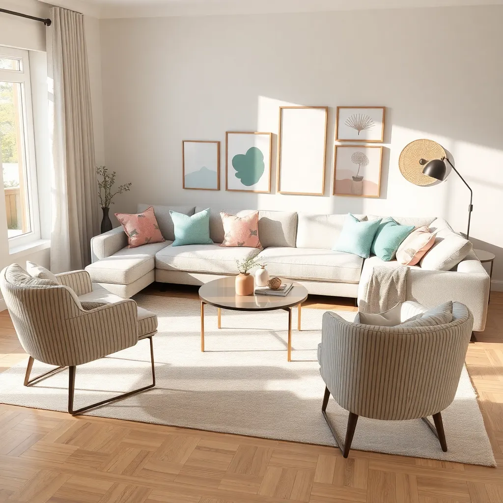
Harmonizing Colors with Patterns
Balancing colors with patterns is essential to create a cohesive and inviting space. Start by choosing a primary color palette that complements the room’s purpose, and then introduce patterns that echo these hues for a harmonious look.
For beginners, a simple approach is to select a dominant color and incorporate patterns in varying shades of that color. This technique can be easily applied using textiles like cushion covers or throw blankets, providing a subtle yet stylish effect.
Advanced decorators might experiment with more daring combinations, such as pairing a bold geometric pattern with a softer floral design. To make this work, ensure at least one color is repeated across the different patterns to maintain visual continuity.
An effective way to test color and pattern combinations is by using small swatches before committing to larger purchases. Arrange these swatches on the furniture or walls to see how they interact in different lighting throughout the day, helping you make informed decisions.
Contrasting Scale for Depth
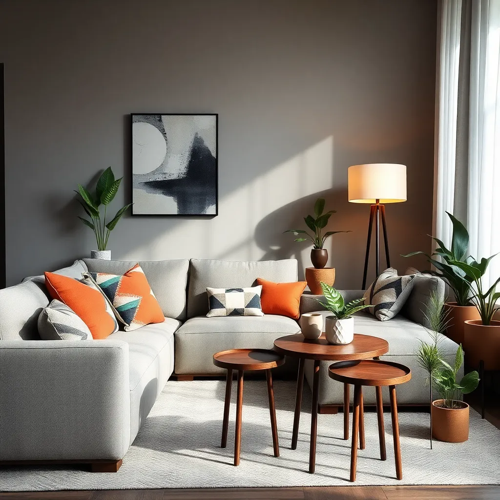
Mixing different scales in your décor can create a sense of depth and intrigue in any room. Start by pairing large-scale patterns, like a bold floral wallpaper, with smaller, intricate designs on cushions or throws to achieve a balanced yet dynamic look.
Incorporate varying scales through furniture choices as well—consider a large sectional sofa paired with a petite side table. This contrast not only adds visual interest but also accentuates each piece’s unique design attributes, making your space feel more cohesive.
For those keen on experimenting, try mixing oversized artwork with smaller decorative items. Hang a large statement piece above a console table adorned with small sculptures or photo frames to draw the eye and create an engaging focal point.
Color coordination is crucial when working with contrasting scales to maintain harmony in your space. Opt for a unifying color palette that ties together disparate elements, ensuring the room feels intentional and well-curated.
Integrating Patterns in Accessories
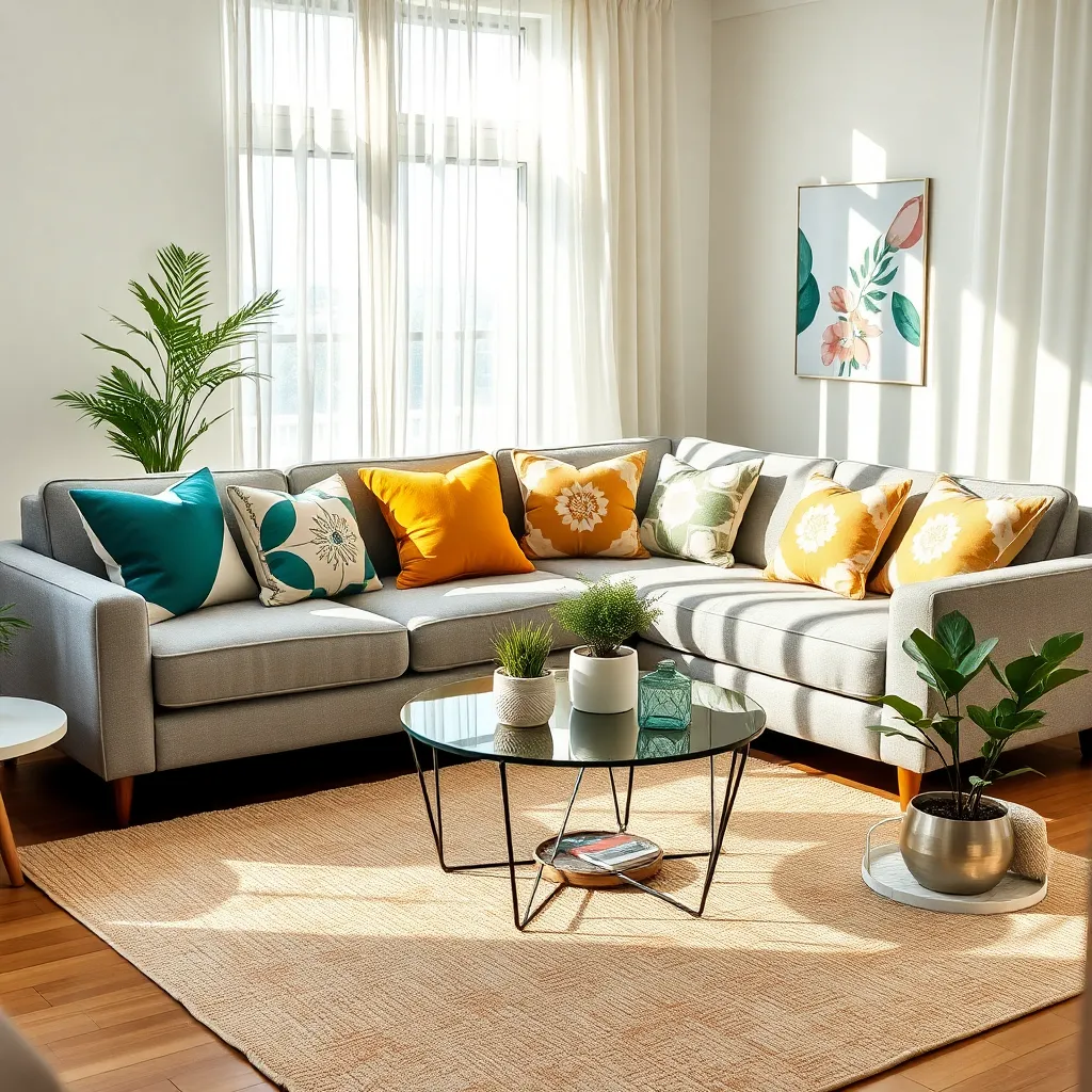
Patterns are a powerful tool in interior design, especially when used in accessories to create visual interest. Begin by selecting a few key pieces, such as throw pillows or rugs, to introduce patterns into a room without overwhelming the space.
A good starting point is to match the scale of the patterns with the size of the accessories. For example, larger patterns work well on substantial items like rugs, while smaller, intricate designs are perfect for smaller accessories like cushions.
Consider the color palette of your existing decor when choosing patterned accessories. Harmonizing the colors in the patterns with existing hues in your room will create a cohesive look, while contrasting colors can add a bold, dynamic touch.
For those with a more advanced design skillset, try layering different patterns in the same accessory category. A stack of cushions with varying patterns can create a curated look; just ensure there’s a common color or theme to tie them together.
Creating Cohesion with Repetition
One effective way to create cohesion in your home is through the repetition of patterns. This technique can be as simple as repeating a geometric motif in your rugs, cushions, and wall art to create a unified look.
Repetition doesn’t mean everything has to match exactly; instead, aim for visual echoes throughout your space. For instance, if your living room features a floral pattern on the curtains, consider incorporating similar floral designs on throw pillows or an accent chair.
When selecting patterns to repeat, choose those that complement your existing color scheme. A consistent color palette, such as blues and greys, can tie varied patterns together, ensuring they don’t clash but rather enhance each other.
For advanced decorators, consider mixing scale within your repeated patterns. Use a large-scale pattern on a focal wall and smaller-scale versions on accessories to maintain interest without overwhelming the space.
Personalizing Spaces with Unique Prints
One way to infuse personality into your home is by incorporating unique prints that reflect your style and interests. Start by selecting prints that resonate with you, such as vintage botanical illustrations, modern abstract art, or culturally-inspired patterns, to create a personal and distinctive atmosphere.
Consider using prints in unexpected places to add an element of surprise and delight. For instance, upholster a single piece of furniture, like an armchair or ottoman, with a bold, patterned fabric that contrasts with the rest of your decor for an eye-catching focal point.
Mixing different prints can be daunting, but by maintaining a cohesive color scheme, you can create a harmonious look. Choose prints that share a common color palette and layer them through textiles like throw pillows, curtains, or rugs to ensure they complement rather than clash.
For those more confident in their styling abilities, try experimenting with scale and proportion in your patterns. Pair large-scale prints with smaller motifs to add depth and interest to a room, and don’t shy away from combining different pattern types, like stripes and florals, to create a dynamic visual experience.
Conclusion: Growing Success with These Plants
In exploring the art of mixing patterns in home decor, we uncover valuable relationship insights: embracing diversity, honoring individuality, mastering balance, fostering communication, celebrating contrasts, nurturing patience, valuing compromise, encouraging creativity, sustaining harmony, building trust, and cultivating flexibility. These concepts, though rooted in design, are foundational to nurturing thriving relationships.
As a next step, choose one of these concepts and apply it to your relationship today. Perhaps start by embracing diversity—plan an activity that highlights your unique interests. This small action can set the stage for deeper connection and understanding between you and your partner.
Remember, relationships, like beautifully designed spaces, require ongoing attention and care. Bookmark this article as a handy guide, ensuring these insights are always at your fingertips. By revisiting these principles, you empower yourself to continually enhance and enrich your relationship.
Looking ahead, envision the success that awaits when you integrate these patterns into your relational fabric. With each thoughtful application, you create a dynamic, resilient partnership that adapts and thrives. Here’s to building a beautiful relationship tapestry, one intentional step at a time. Save this article now and let it be your trusted companion on this enriching journey.