
When it comes to transforming a space into a serene sanctuary, nothing does the job quite like a neutral color palette. Whether you’re just dipping your toes into the world of interior design or have been curating your home’s aesthetic for years, neutrals offer a timeless elegance that can be both a subtle backdrop and a standout feature. These colors are more than just safe choices; they are the unsung heroes that can enhance architectural details, create a sense of calm, and provide the perfect canvas for your personal style.
Neutral palettes are incredibly versatile, allowing for endless experimentation with textures and materials without clashing or overwhelming. In this article, we’ll delve into how you can use neutral tones to create harmony and sophistication in any room of your home. You’ll discover the art of layering different shades to add depth and interest, as well as how to incorporate natural elements and bold accents to make your space truly unique.
We’ll guide you through selecting the right neutrals that complement your existing decor while still making a statement. For those who crave a bit of adventure, we’ll explore how to add unexpected pops of color that harmonize with a neutral base, offering a fresh take on this classic approach. By the end of this article, you’ll be equipped with the knowledge to confidently use neutral palettes to craft spaces that are not only beautiful but also reflective of your individual taste.
Understanding Neutral Color Basics
Neutral colors form the foundation of many interior design schemes, offering a versatile backdrop that allows other design elements to shine. When selecting neutral hues, consider shades like beige, gray, and soft whites, as these can complement a wide range of styles and furnishings.
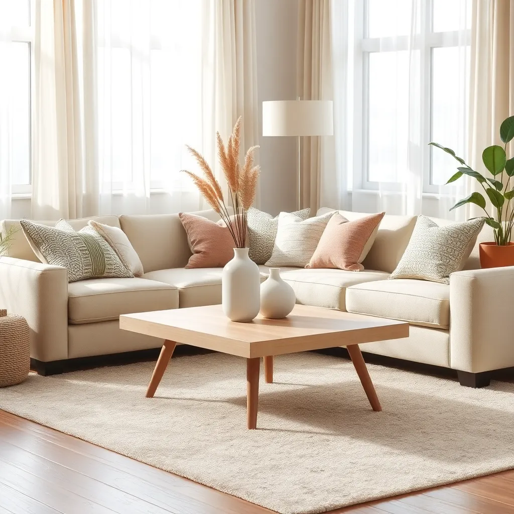
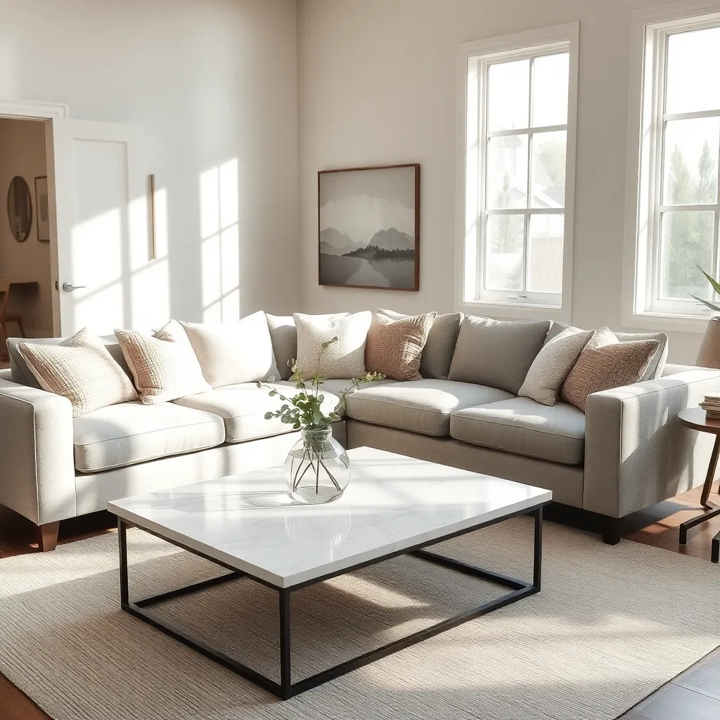
To create a balanced space, incorporate different textures and materials with your neutrals. For example, pair a soft gray wall with a plush cream-colored sofa and a woven jute rug to add visual interest and warmth.
Layering is key when working with neutral color palettes to avoid monotony and create depth. Choose a combination of matte, glossy, and textured finishes in your furniture and accessories, such as a velvet throw on a linen couch or a glass coffee table against a rustic wooden floor.
For a more advanced approach, consider using varying shades within the same neutral color family to create a cohesive look. This could involve mixing light and dark grays in your furniture and decor, ensuring that each piece stands out while maintaining harmony.
Choosing the Right Neutral Shades
When selecting the right neutral shades, consider the natural light in your space as it dramatically affects how colors appear. South-facing rooms often complement warm neutrals, while north-facing spaces benefit from cooler tones to counteract the lack of sunlight.
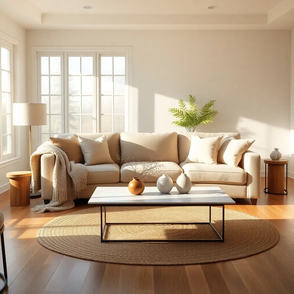
Pairing neutral shades with textures can add depth and interest to a room. For instance, using a matte taupe wall can be beautifully offset with a glossy white or metallic accent, providing contrast and sophistication.
It’s essential to understand the undertones of neutral shades to ensure a cohesive look. Beige with a pink undertone may clash with a yellow-toned cream, so always test samples in your space alongside existing decor elements.
For those looking to create a more dynamic neutral palette, consider layering various shades within the same color family. Using a soft gray on walls, paired with charcoal furnishings and light gray accessories, offers a harmonious and elegant look.
Layering Textures with Neutrals
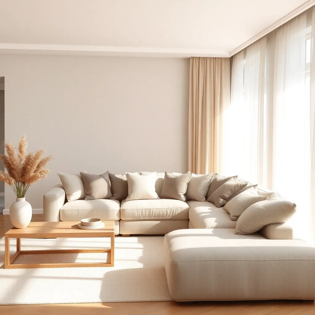
The art of layering textures with neutrals involves combining various tactile elements to create depth and interest in a space. Start by selecting a foundational piece, such as a neutral-toned sofa, and build upon it with cushions in different fabrics like linen and velvet for a rich, tactile experience.
Introduce contrast by incorporating a mix of materials; for example, a chunky knit throw can add warmth and softness against the sleekness of a leather chair. To maintain cohesion, choose elements within the same color family but vary the shades and textures to avoid a flat, monotonous look.
Rugs are another excellent way to add texture, especially when using a neutral palette. Opt for natural fibers such as jute or sisal to create a grounding effect, and layer a smaller, plush rug on top for added comfort and visual appeal.
For those looking to experiment further, consider mixing textures with your wall finishes. A matte paint can serve as a backdrop, while a textured wallpaper or paneling can provide an unexpected, yet cohesive, focal point.
Accenting Neutrals with Bold Touches
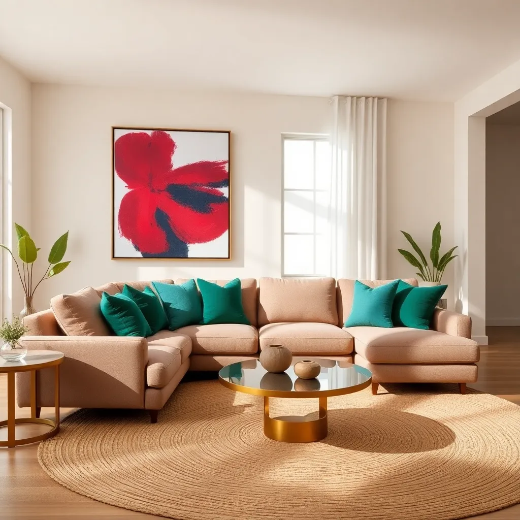
Introducing bold touches into a neutral color palette can dramatically transform your space without overwhelming it. Start by selecting one or two vibrant colors that complement your existing neutral scheme, such as a deep emerald or a rich navy, to add depth and interest.
Consider incorporating these bold hues through focal pieces like artwork or statement furniture. A large painting with splashes of color or a striking armchair can serve as a centerpiece, drawing the eye and adding character to the room.
For those who prefer subtlety, consider using accents like throw pillows, rugs, or curtains in your chosen bold color. These items can be easily swapped out for a different color or pattern when you’re ready for a change, offering flexibility and room for experimentation.
Advanced decorators might explore the use of bold patterns on a single accent wall or in upholstery, creating a dynamic contrast with the neutral surroundings. Pairing these bold elements with natural materials like wood or rattan can balance the vibrancy, ensuring the space remains warm and inviting.
Maintaining Harmony in Neutral Spaces
Creating harmony in neutral spaces begins with a balanced selection of shades. Choose varying tones of the same color family, such as taupe, beige, and cream, to add depth and interest without overwhelming the eye.
Furniture placement plays a crucial role in maintaining a harmonious feel. Use symmetry in your layout by positioning sofas or chairs in a way that mirrors each other, which can help create a natural flow and a sense of order.
Incorporate a mix of textures to enrich a neutral color palette. Pair smooth materials like leather or polished wood with softer fabrics such as linen or cotton to add warmth and dimension to the space.
For a more advanced touch, consider layering natural materials like stone, wood, and metal. These elements not only add texture but also harmonize with neutral shades, creating a cohesive and inviting environment.
Lighting is another critical element in a neutral space, as it can dramatically affect how colors are perceived. Opt for a combination of ambient, task, and accent lighting to highlight different areas and add subtle visual interest without disrupting the neutral scheme.
Conclusion: Growing Success with These Plants
In exploring the art of neutral color palettes, we delved into five key relationship concepts: the importance of balance, the power of subtle communication, the art of creating a calming environment, the role of compromise, and the beauty of simplicity. Each concept serves as a metaphor for building strong, harmonious connections. Just as a carefully chosen palette can transform a space, these principles can enrich your relationships, ensuring they remain vibrant and resilient.
As an actionable next step, take a moment to assess how balance and subtlety play out in your current relationships. Initiate a conversation with your partner or loved one about creating a more peaceful and understanding dynamic, much like crafting a serene living space.
To ensure these valuable insights are always at your fingertips, bookmark this article now. By doing so, you will have a handy guide to revisit when nurturing your relationships.
Remember, the journey to relationship success is an ongoing process, filled with opportunities for growth and deeper connection. As you move forward, embrace these principles and watch your relationships flourish, just like a beautifully curated neutral palette.