
Unlocking the secret to a beautifully styled home often involves more than just selecting the right colors or furniture pieces. It’s about mastering the art of mixing patterns—a skill that can transform any space from mundane to magnificent. Whether you’re a newcomer taking your first steps into the world of home decor or a seasoned decorator seeking fresh inspiration, understanding how to blend patterns is a game-changer. Patterns tell a visual story, adding depth and personality to your living spaces in ways you might never have imagined.
The importance of pattern mixing in interior design cannot be overstated. It allows you to infuse your home with character and vibrancy, creating dynamic environments that feel both cohesive and intriguing. In this article, we’ll guide you through the essentials of pattern mixing, unveiling seven must-have combinations that can elevate your home’s aesthetic. You’ll learn how to balance bold designs with subtle textures, ensuring every room reflects your unique style and creativity.
As we explore these pattern pairings, you’ll gain the confidence to experiment and innovate within your own home. We’ll provide practical tips and insights that make this seemingly daunting task approachable and enjoyable. So, whether you’re eager to add a splash of excitement to your living room or refine the harmony in your bedroom, our curated guide will empower you to make informed, inspired design choices. Let’s embark on this creative journey together and discover how you can effortlessly weave patterns into the fabric of your home.
Understanding Pattern Mixing Basics
Mixing patterns in home decor is an art that can dramatically transform a space when done correctly. Start by selecting a dominant pattern that sets the tone for the room, such as a bold floral or geometric design.
Once you have your primary pattern, introduce a secondary pattern that complements but doesn’t compete with the first. This could be a smaller-scale design like stripes or polka dots, which can be incorporated through pillows, throws, or curtains.
For a more advanced look, consider adding a third pattern that introduces a new texture or color. This could be an abstract design or a textured fabric, like a woven or embroidered piece, to add depth and interest.
When selecting patterns, pay attention to the color palette to ensure harmony. Stick to a cohesive color scheme where all patterns share at least one common color to maintain balance and unity throughout the space.
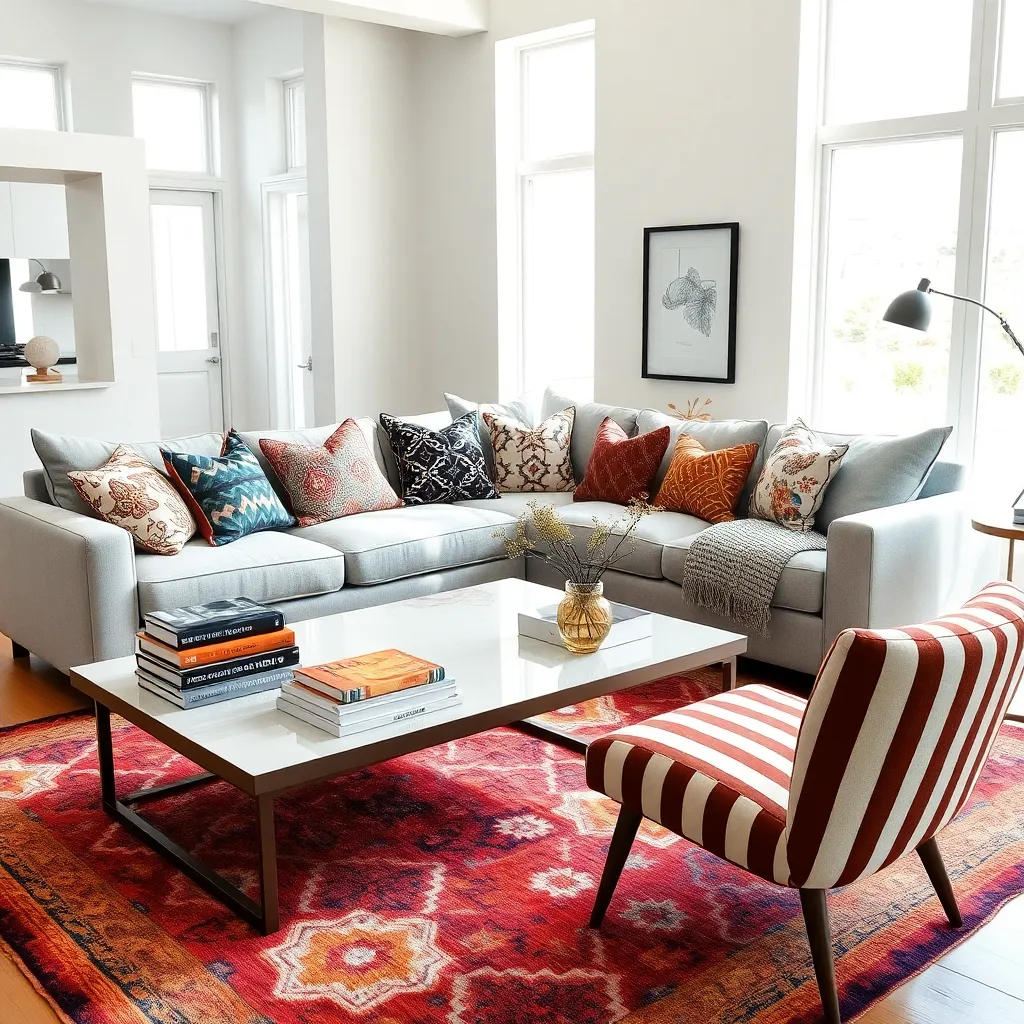
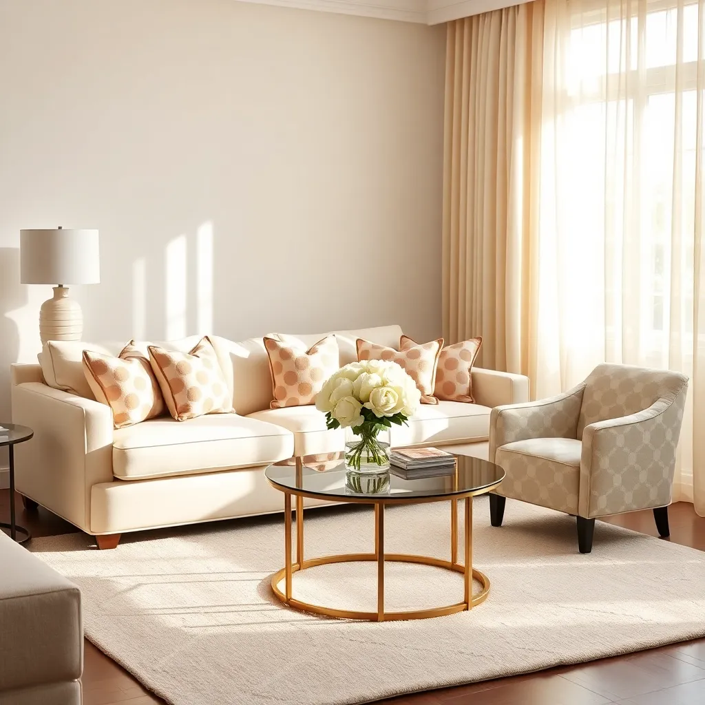
Stripes and Florals: A Classic Duo
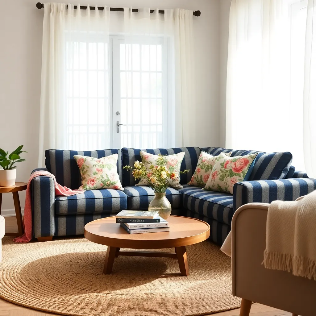
Stripes and florals are a timeless pattern pairing that can effortlessly elevate any room’s aesthetic. To successfully mix these patterns, start by choosing a unifying color palette that ties both elements together, ensuring a cohesive look throughout your space.
For beginners, a simple way to incorporate stripes and florals is by using textiles like throw pillows or curtains. Select floral prints that share at least one color with your striped pattern to create harmony without overwhelming the room.
More advanced decorators might consider mixing scales to add depth and interest. Pairing a bold, wide-striped sofa with delicate, small-scale floral cushions can create contrast and intrigue, bringing a sophisticated touch to your living room.
When selecting furniture, consider a neutral backdrop to allow the patterns to stand out without clashing. Opt for solid-colored furniture pieces and introduce stripes and florals through accessories and accents, which are easy to update as trends or your tastes change.
Geometric Patterns for Modern Flair
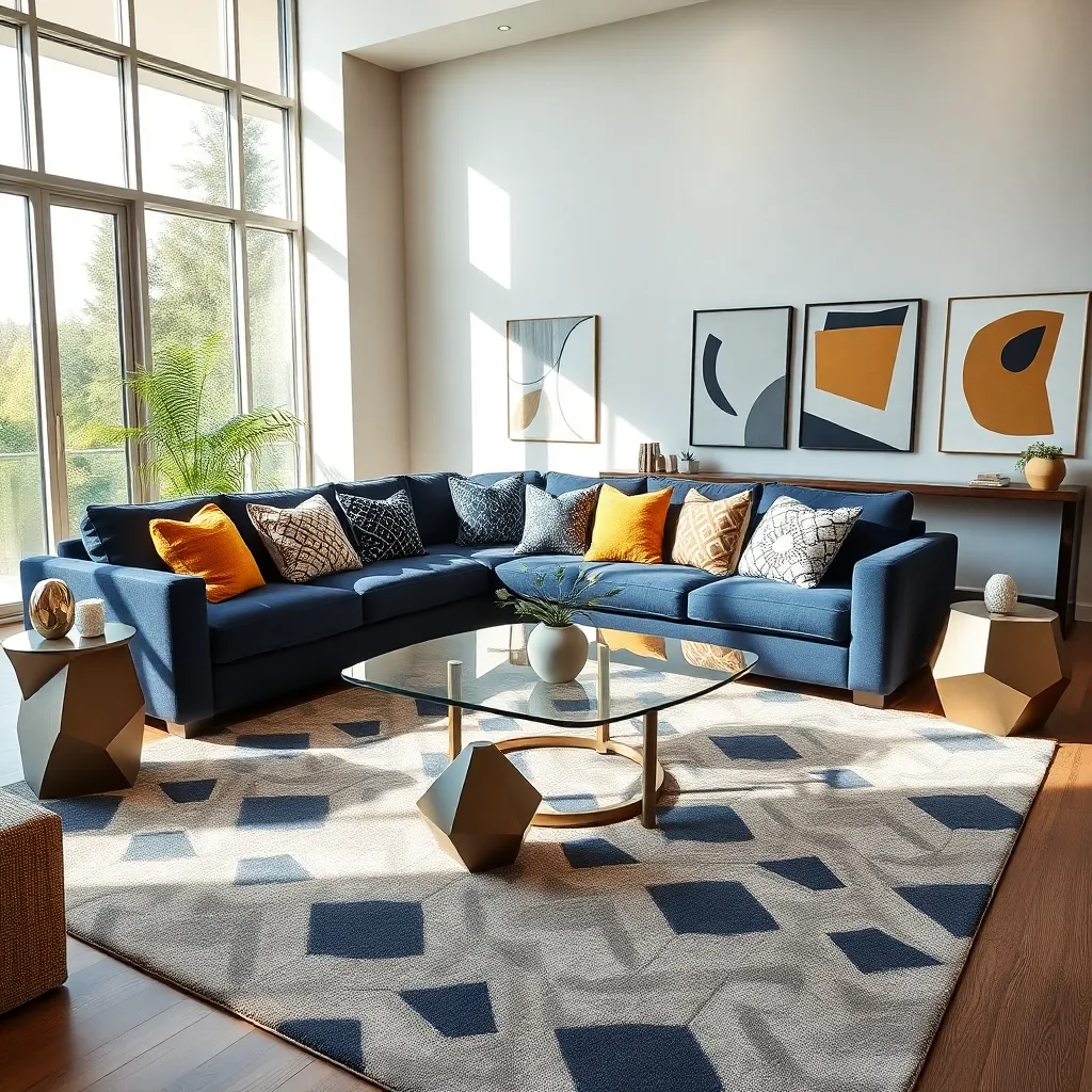
Introduce a modern flair to your space by incorporating geometric patterns, which are both versatile and bold. Consider using geometric-patterned rugs or cushions to add an element of visual interest without overwhelming the room.
To create a cohesive look, pair geometric patterns with solid colors that complement their hues. Select a dominant color from the pattern and use it in other decor elements, such as curtains or wall art, for a balanced appearance.
Advanced decorators can experiment with layering multiple geometric patterns by keeping the color palette consistent. A black and white color scheme is a sophisticated choice that can unify different geometric designs in a single space.
When selecting furniture, opt for pieces with clean lines to harmonize with the structured nature of geometric patterns. Look for furniture with angular or asymmetrical shapes to echo the patterns and maintain a modern aesthetic.
Incorporating Animal Prints Boldly
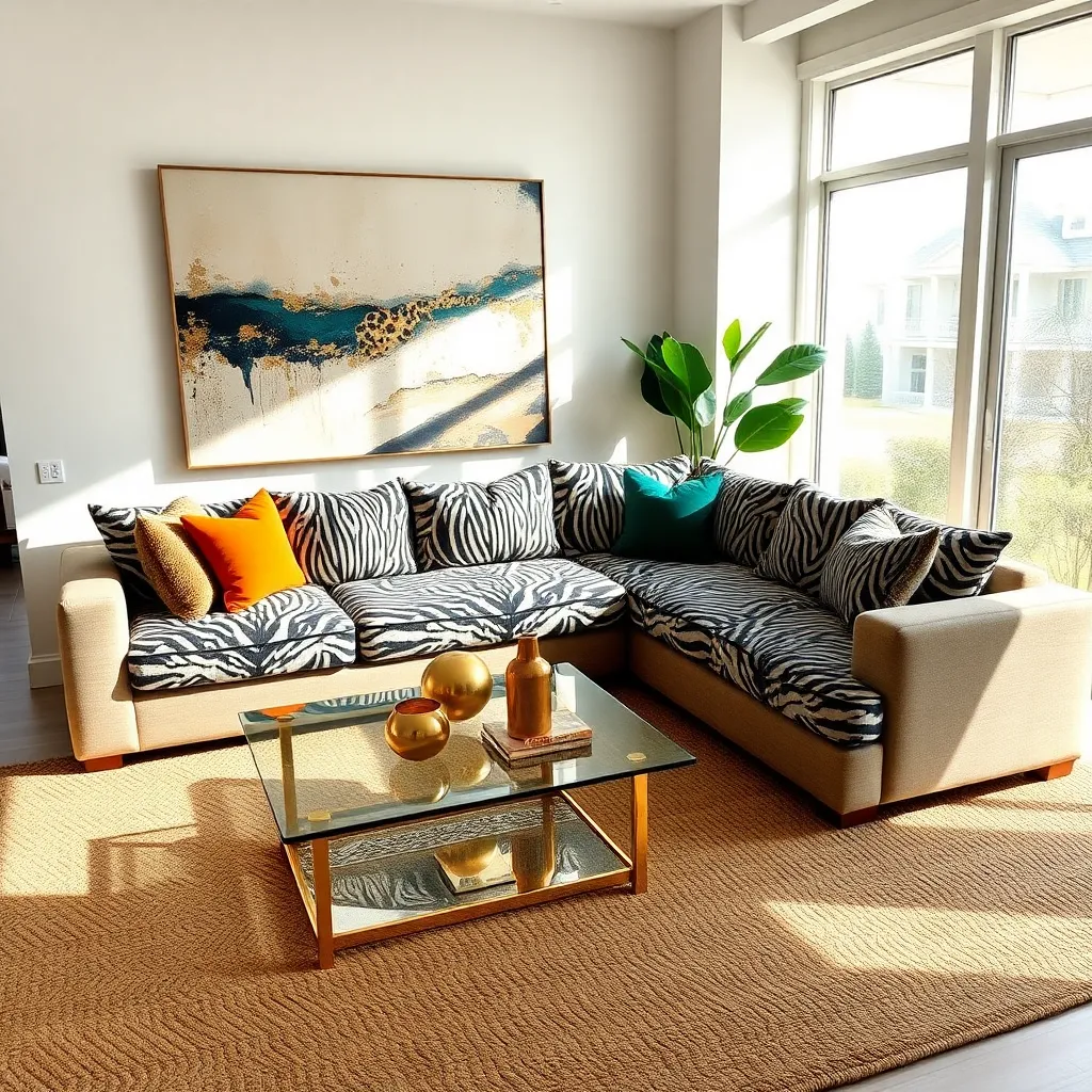
Animal prints can add an element of wild sophistication to any room, making them a bold choice for those looking to spice up their decor. Start by selecting a single animal print—like leopard, zebra, or cheetah—and use it as an accent through throw pillows or an area rug to create visual interest without overwhelming the space.
To achieve a cohesive look, pair animal prints with neutral colors such as beige, black, or white, which allow the patterns to stand out. Consider using these prints in a balanced way; for instance, a zebra print ottoman can act as a statement piece, while leopard print can be subtly introduced through smaller items like lampshades or picture frames.
For beginners, it’s essential to keep the scale of the pattern in mind—larger prints can make a bold statement, while smaller ones lend themselves to more delicate, understated accents. Mixing animal prints can also be done, but ensure they share a similar color palette to prevent clashing and maintain harmony in the decor.
Advanced decorators might experiment with layering different textures alongside animal prints, such as pairing a faux fur throw with a cheetah print chair. This approach adds depth and complexity to the room, allowing for an eclectic yet polished look. When mixing prints, remember to balance bold patterns with solid colors in other elements like curtains or walls to avoid visual chaos.
Polka Dots: Playful Yet Elegant
Polka dots can inject a sense of whimsy and sophistication into your home when used thoughtfully. Start by incorporating them into smaller decor elements, like throw pillows or a statement rug, to create visual interest without overwhelming the space.
Consider using polka dot patterns in a monochromatic color scheme for a subtle yet chic effect. Black and white polka dots can add a timeless elegance, while a pastel palette softens the look for a more relaxed, playful vibe.
When integrating polka dots into your decor, balance is key. Pairing polka dot elements with neutral furniture can prevent clashing and maintain a cohesive look, allowing the patterns to shine without dominating the room.
For a bold statement, consider a polka dot accent wall in a children’s room or a creative workspace. Choose a larger dot pattern for a more dramatic effect, or smaller dots for a subtle texture that adds depth to the space.
Layering Textures for Depth
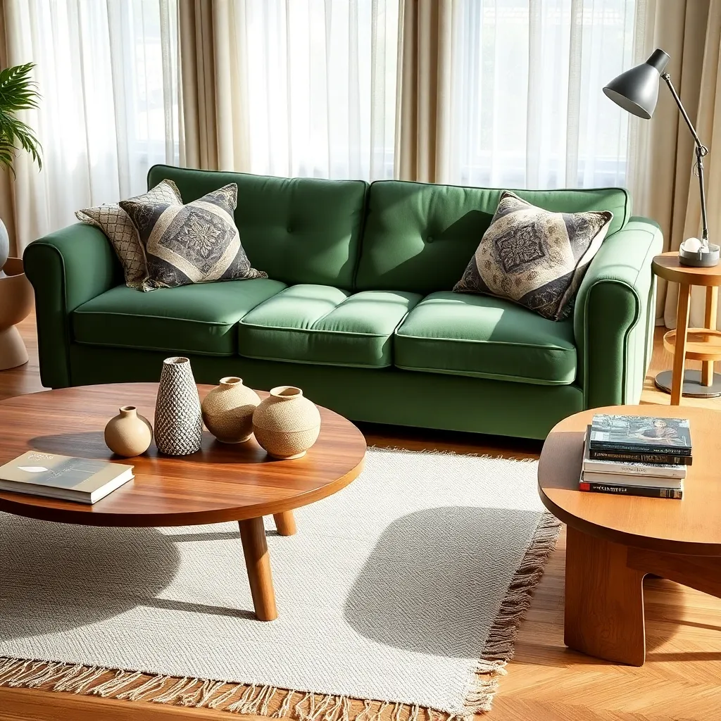
Layering textures is a transformative technique that adds depth and richness to any room. To start, consider incorporating a mix of materials such as velvet, linen, and leather for a sophisticated look.
Begin with a base of neutral tones to allow different textures to stand out without overwhelming the space. For instance, a beige linen sofa can serve as the perfect backdrop for a plush velvet throw in a rich jewel tone.
Incorporate varied texture through accessories like cushions and rugs, which can instantly elevate the room’s ambiance. Mixing a wool rug with silk curtains introduces a tactile contrast that adds interest and dimension.
For a more advanced approach, layer textures within the same color family to create a cohesive yet dynamic look. Try pairing a matte ceramic vase with a glossy glass lamp to subtly play with light and shadow.
Balancing Bold and Subtle Patterns
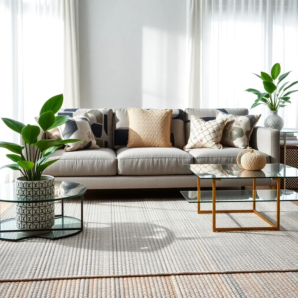
Integrating both bold and subtle patterns in your home decor can create a visually dynamic environment. Start by choosing a dominant bold pattern for a focal point, such as a large area rug or a statement wall, to set the tone for the room.
Once you have established your bold pattern, complement it with subtle patterns on smaller accessories like throw pillows, curtains, or even a secondary rug. These should ideally share a color from the bold pattern to maintain harmony and cohesion.
For those new to pattern mixing, consider using a neutral color palette to keep the overall look balanced and sophisticated. Neutral shades like grey, beige, or white can serve as a calming backdrop, allowing patterns to shine without overwhelming the space.
Experienced decorators might experiment with unexpected color combinations to add depth and interest. Try pairing a bold geometric pattern with a subtle floral or striped design to create contrast while ensuring the patterns vary in scale for a balanced look.
To ensure a seamless blend, layer your patterns strategically by placing smaller patterned items in close proximity to the bold pattern. This technique helps to create a cohesive flow across the space, making the room feel well-planned and inviting.
Conclusion: Growing Success with These Plants
In exploring the ‘7 Must-Have Mixing Patterns In Home Decor,’ we’ve uncovered valuable insights into enhancing the fabric of our relationships through thoughtful design choices. Firstly, integrating complementary patterns encourages harmony, much like balancing differing personalities in a relationship. Secondly, mixing textures introduces depth, akin to embracing diverse emotional experiences. Thirdly, using scale and proportion mirrors finding balance in shared responsibilities. Fourth, integrating a unifying element represents the importance of shared goals. Fifth, experimenting with colors parallels the vibrancy of maintaining passion. Sixth, the rule of three teaches us to prioritize and focus, much like nurturing key aspects of our connection. Finally, embracing asymmetry reflects accepting imperfections, a cornerstone of lasting relationships.
As a next step, consider choosing one of these principles to implement in your home today, sparking conversations about how these elements can strengthen your bond. Remember, your home is a canvas for love and understanding. Save or bookmark this article to revisit these transformative concepts and continue weaving beauty into both your living space and your relationship.
Embrace these design principles as tools for connection, and watch as they help build a foundation for enduring relationship success. Together, let’s create spaces that not only house our lives but also foster our most cherished connections.